Matt De Jong is a Graphic designer who is well known for his
record covers for music artists. For one of our workshops he came to us with a
brief for the vaccines. We had a vinyl cover to design, 3 inner sleeves and
what it would like within an app and a new logo.
For this brief we had to include some key features they
wanted us to include a picture of the band with the covers. They also gave us
an extract, which spoke about how the world has become westernised and how they
wanted to recover the times before people were so easily connected by
technology.
Matt gave us the idea to approach the idea by using a fine
artist as research and use their style of working within ours to give us
inspiration. We firstly had a look through the bands picture they had supplied
and realised they had a running theme; we took this in to account. They had
been traveling Asia. As a group we thought this would be the best path to go
down, because this meant we could elaborate on the brief using one of the
themes of getting back to basics and away from technology. We decided to play
with the text and find artists that use Asian artwork. We found two amazing
artist which were Keiichi Tanaami and Yayoi Kusama. We intergraded this work
with another style of working by looking at Jackson Pollock and his drip
artwork. Our out comes for these practises are all on the Tumblr blog link
above.
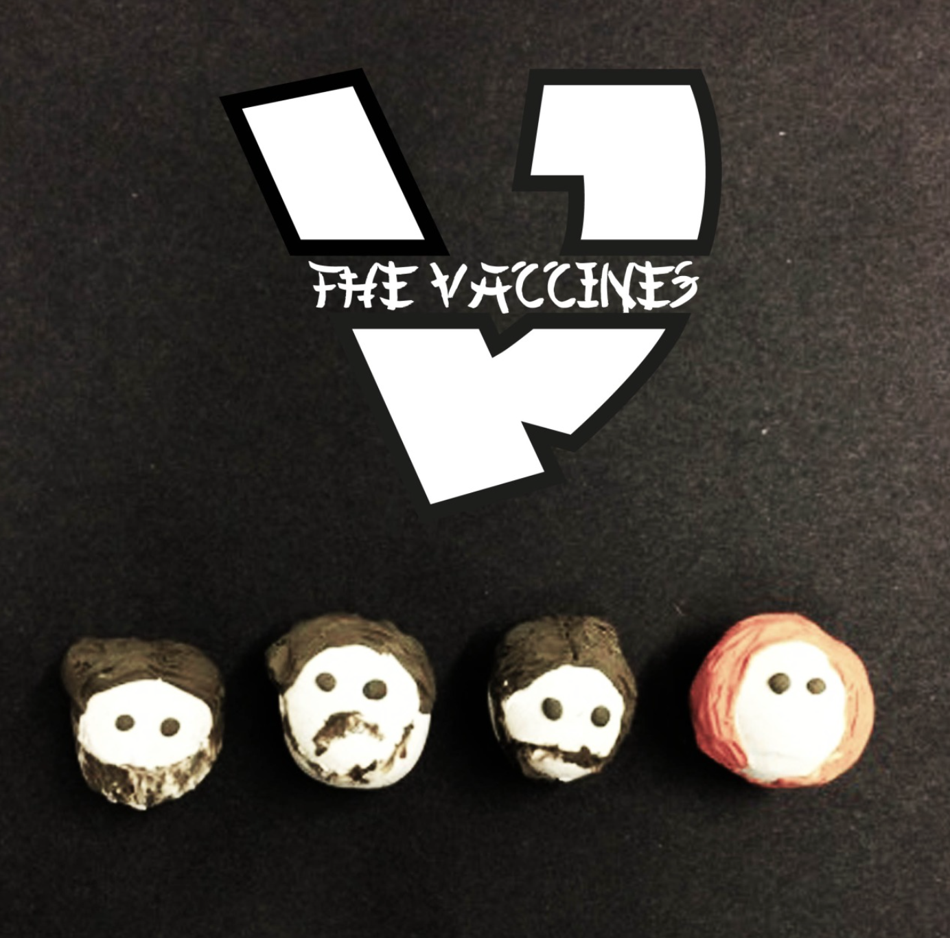
After this we had the idea of making models of the artists
rather using the pictures. We decided this because we thought it would add a
fun element to our work and differentiate us away from the rest of the designs.
We wanted to try as many pieces as possible to see what the best out come would
be. To make our models we were going to use modelling clay called Fimo but
instead we just used coloured modelling clay. We did this because the models
were only going to be photographed then re-edited.
By this point we had all the images together and had a good
set to work with and edit and layer text on to. Alex designed a text around the
Asian theme we were using and got the inspiration for our logo from a previous
band called Wutang clan which almost have an Asian inspired symbol for their
logo.We decided to have a big white and black V as the logo, obviously taken from the name of 'The Vaccines'. Presonally I thought our work was to brief and quite interesting. We worked well as a team and had a lot of creative output between us. If we were to do this again I think we would all agree and work more efficiently together and quicker.
Group Participants-
Alex Richardson - Designer: Type and image
Zoe Jackson - Ideas, Research, Virtual Designer
Jamie Popple - Ideas, Research, Virtual Designer
Jason Durrant - Ideas, Research, Blog Designer
Alicia Lolotte - Model maker, Research, Ideas and Practice
Group Participants-
Alex Richardson - Designer: Type and image
Zoe Jackson - Ideas, Research, Virtual Designer
Jamie Popple - Ideas, Research, Virtual Designer
Jason Durrant - Ideas, Research, Blog Designer
Alicia Lolotte - Model maker, Research, Ideas and Practice


No comments:
Post a Comment